The N Logo
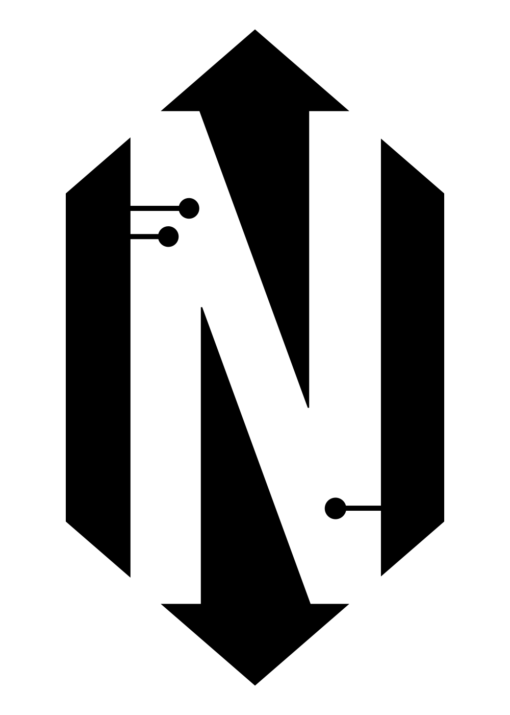
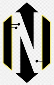
Back when Null Signal Games was growing out of their prior name (Project Nisei), I had designed a logo for Netrunner that I was going to pitch as a replacement, but that didn't go anywhere and so I dusted it off for the documentary and to use as the card backs in the poster artwork and it's nice to give it a new life.
The Design Process
I don't know how other designers do things as I've rarely worked inside an agency, but I gather inspirational images, colors, shapes, letters, fonts, and start putting them on a blank page and seeing what interests me. This one came together somewhat quickly and painlessly, as I recall, and I've broken apart the elements below.

The Credit
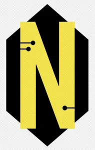
The main shape of the logo is the hexagon that represents credits (money) in the game. This felt like an obvious starting point for at least one design variation.
The Letter N
Another obvious one. N for Netrunner. But the size and position of that letter are everything that makes this design work.
The Counter Arrows
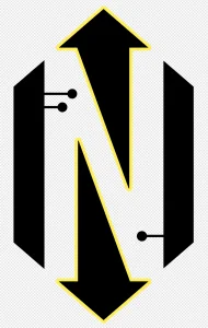
The negative spaces left behind (the counters or holes) from the oversized and overlapping N naturally created these dynamic arrow shapes, pointing at the game's two opponents. Nice.
The Traces
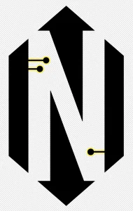
The electronic circuit trace elements (like you see on a circuit board) are asymmetrical, with two on top and one below, representing the asymmetry in the playstyles of the runner and the corporation.
The Cards
Finally, the two side elements suggest the cards (or decks of cards), without which there'd be no game.